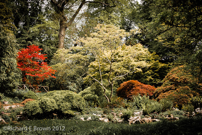
If your into printing then there is a hot and vocal debate on the use of OBA’s.
First what is an OBA?
Well its an Optical Brightening Agent. In the old days this was a coating on the paper, now most papers that have OBA’s have it built into them.
What does it do?
It turns Ultraviolet light outside of the visible spectrum and fluoresces it into white light that can be seen, this then gives a pure bright white that makes the blacks look black and improves the contrast of the image.
So why the debate?
Well back when they first came out the coating wore away, not an issue as then the paper acts like a natural paper, the issue was it wore unevenly and made your prints look blotchy.
Manufactures say they have now fixed this and that they will wear evenly, but many photographers and printers who want the work to last do not trust them anymore.
If your picking a paper that uses OBA’s you also need to consider how it will be displayed; if framed behind glass or most modern perspex then it will not work and you will get a normal white. If its framed in a room receiving little natural light then again you will not get the affect.
I have been testing some papers recently that have OBA’s and the whites can be better then naturals but there are also other methods to get a better white that can be used.
Once you have imported your photographs into a DAM (Digital Asset Management) Package, then to get the most from your photographs, especially if your a professional photographer who may need to lay there hands on a particular image months or even years later there are a number of key tasks to perform.
First is meta data, simple things like location files were shot, copyright information, basic key wording etc.
Then there is developing the files. The Adobe Camera RAW engine using process2012 is very powerful but the import process does tend to flatten your images resulting in RAW files that will not look anything like as good as out of camera jpegs.
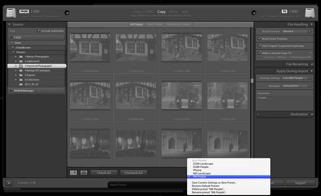
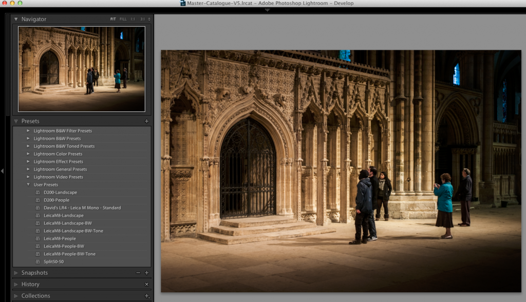
I have a number presets to speed things up. First common meta data presents with my copyright information and some location presets for locations where I shoot a lot.
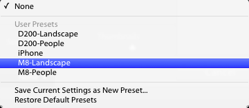
Then there are develop settings, some are camera specific, and also apply basic sharpening based on if they are Landscapes or People focused.
The key to really speeding things up though is to set these up with your import presets, thus as you can see above, when I import files from my Nikon D200, if the pictures are mainly landscapes I choose the D200-Landscape preset. This preset apples my basic landscape metadata and copyright information, it sets a backup hard drive destination so the files get backed up to a second disk during the import. It applies the develop preset I have configured for my Nikon D200’s and does some basic import sharpening optimised for Landscapes. It then ups the contrast and vibrance reduces the saturation slightly and brightens the shadows.
The Leica M8 presets similarly tweak contrast reduces red channel saturation and applies a tone curve.
Using these imports I can get to a position quickly where I just need to add some detail location information, final specific keywords, white balance and a slight tweak to the develop settings.
If I am shooting fixed subjects like landscapes or buildings then is likely to only be a few shots of each scene. When shooting wildlife or people then I can end up with a thousand or more images to have to sort through.
Well the first job is to get those image on to internal hard disk of my computer. I then import and copy them into the local Lightroom. The import also copied the files to an external disk. Once the majority of the editing is complete the Lightroom files get moved to external disk. By this time Apple’s time machine will also have a copy on its disk so I’ll havE several copies before the memory cards get wiped and I also clear down the local hard disk for the next set of images.
Something to remember with Adobe Lightroom V5 is that you can create something called a smart preview. This enables you to edit and image but not actually have the image with you, great for when your out and a about but wanting to get some work done on an old MacBook Air with only a small SSD inside.
So you now have a thousand or so images sat in Lightroom, how do you quickly find the great ones. Well there are several ways but I find it a lot easier if I use two monitors, one set to grid view and the other set to loupe. This enables you to flick through the your images in grid view but evaluate them properly.
I also tend to group similar photographs together, you can then just pick a couple of good ones that ones that are very similar.
I also find its good to do an edit close to taking the photographs but also go back over your old work and look again at the ones you did not select. To often you can chose photographs because of the amount of effort it took to capture and not based on the content. Time can be a good equaliser.
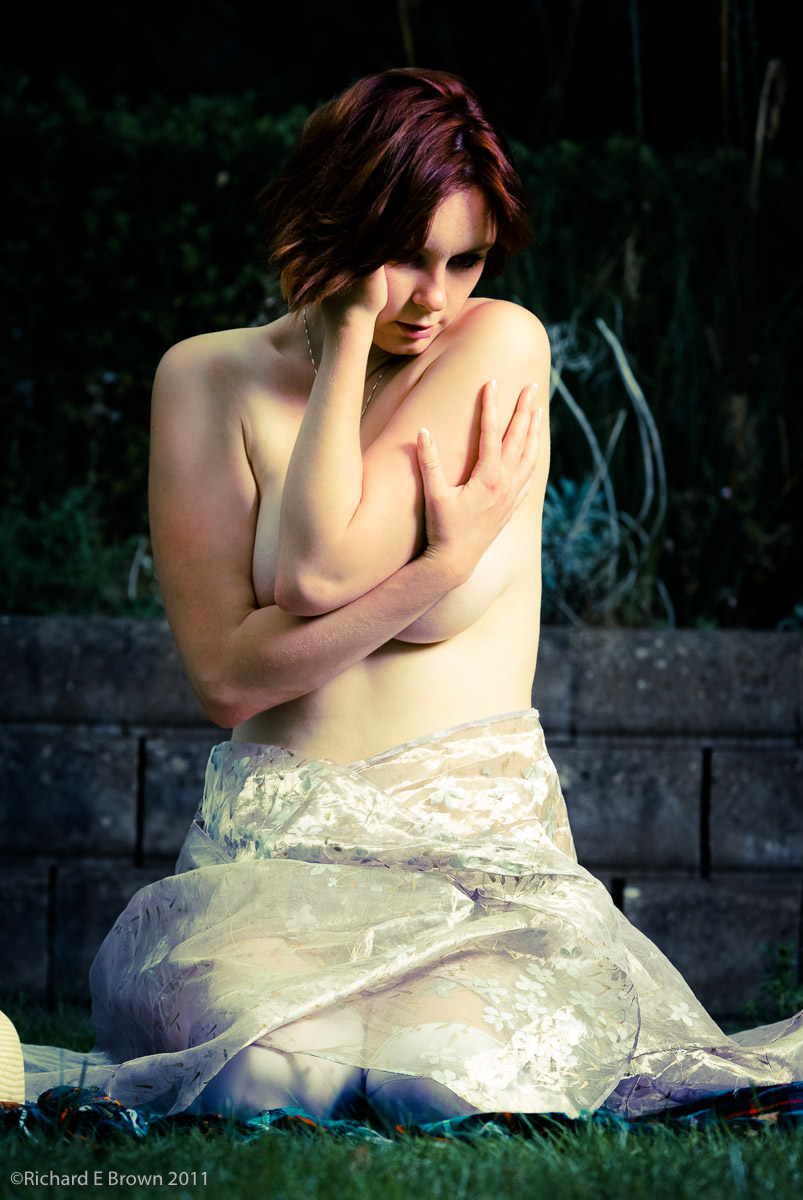
I always like where possible to get things right in camera. The above shot was taken outside in the garden, the sun was a light source but I also used a Elinchrom flash head and large softbox on a C Stand, the flash was actually the main source and the daylight as fill, but often its just not possible to do this kind of thing as the location is not suitable.
It is in situations like this where compositing can be the answer. You take a photo outside to use as a background and take the main photo in the studio. You then combine the two using photoshop.
Below is a quick fantasy composite that is not intending to be realistic to show what I mean.
The key to making a realistic composite is making the lighting match and shooting with the intention of making a composite.
The above shot would make a likely composite. The plain background was due to a seamless infinity curve in the studio, would make it easy to select just the model and place it on a background.
For the backgrounds I have never had a lot of success but then I read some tips on Scott Kellby’s blog about shooting for backgrounds.
An area that is often missed is that of camera profiles.
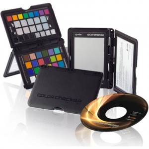
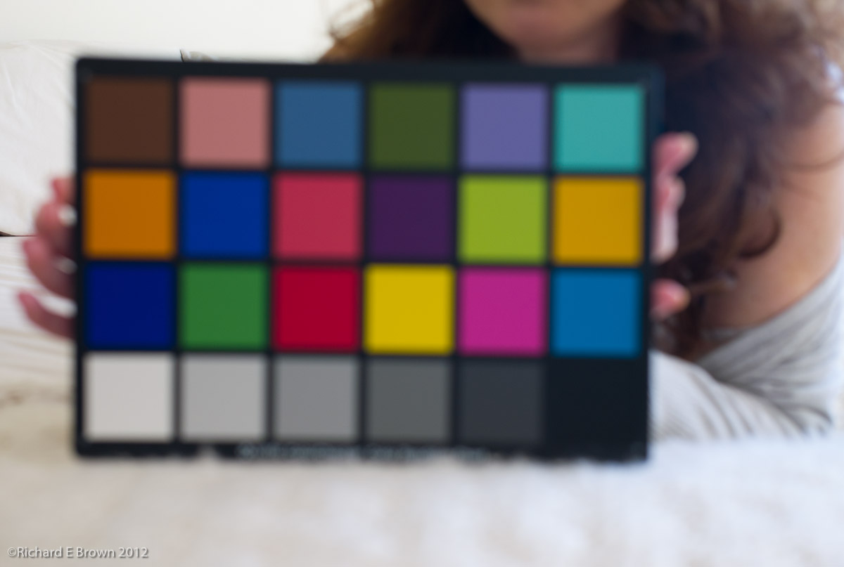
Building a custom colour profile for your camera is relatively easy with tools such as the X Rite ColorChecker, but today Adobe tend to build very good camera profiles into their products. If your a studio worker then photographing a grey card at the start of your session and getting your white balance correct, plus using the built in profile in Photoshop or Lightroom will get you accurate colours.
Once your screen is calibrated, what about your printer? Well the output of the printer generally depends on the inks and the paper. You can get calibration devices to scan your prints and build custom profiles but today there is an easier option. Many of the top paper manufacturers have prebuilt profiles for there paper on there websites. Its just a matter of downloading and using.
With a correctly profiled screen and printer, plus using techniques such as soft proofing one can get prints that are close to what you see on the screen.
Profiling your screen is possibly the easiest thing to do. Its also absolutely essential, unless your know the colours you screen is displaying how can you know what you are doing during the editing process.
X-Rite are possibly the best know company in modern profiling technology.
The first step to profiling your screen is to get hold of a measuring tool, for as little as a £100 you can now get a simple screen calibrating tool
Its a simple USB device that measures the output from you screen, the software flashes up known colour values and the calibrator measures the output value, it then generates a screen profile for your computer. This profile then ensures your screen displays colours accurately.
Profiling is a key element of modern digital post processing.
Many people just shoot and publish either on web or paper, but getting your images to look right can be tricky if you do not fully understand all the elements.
Using the correct colour space, shooting RAW, calibrating your monitor are all essential elements to shooting digital and getting good output. Then there is Camera Calibration Profiles, Print Profiles etc. For beginners it can quite a minefield.
There is also the fact that not all monitors are created equal and laptop screens are inferior to desktop monitors, and while it may seem contrary to common sense, Black & White photography needs even higher end monitors then does colour.
A few years ago trying to get all these elements correct would prove extremely challenging but today things are a little easy.
High quality monitors which can approach the AdobeRGB Colour Space are now available well under £1000, cameras have a setting for AdobeRGB, and Software tools like Adobe Lightroom and Photoshop support work spaces like ProPhoto RGB, to maximise range of colours and tones available while editing.
Its a fact that while people understand that the computer screen can display a different set of colours and a wider dynamic range it is not better or superior to a paper print. Then there is the web, many browsers while capable of handling colour management some do not. sRGB is still the colour language of the internet and a picture in a web browser is a poor substitute for your own calibrated screen showing your own work in Adobe Lightroom/Photoshop or Apples Aperture, or a fine print.
The best way of learning is to attend a good course on the subject but the next best thing is to purchase the series of video tutorials on the website Luminous Landscape.
Over the next few posts i’ll attempt to offer an introduction to the art of profiling, because without it no matter how you edit your photographs you are working in the dark.
Where possible I have tried to standardise on as few post production software packages as I can.
The majority of my work is all done in Adobe Lightroom but sometimes you need either the added power of a third party plug-in or application or its just easier to do in some packages.
I feel its better to be a master of one package and try to do as much as I can in it.
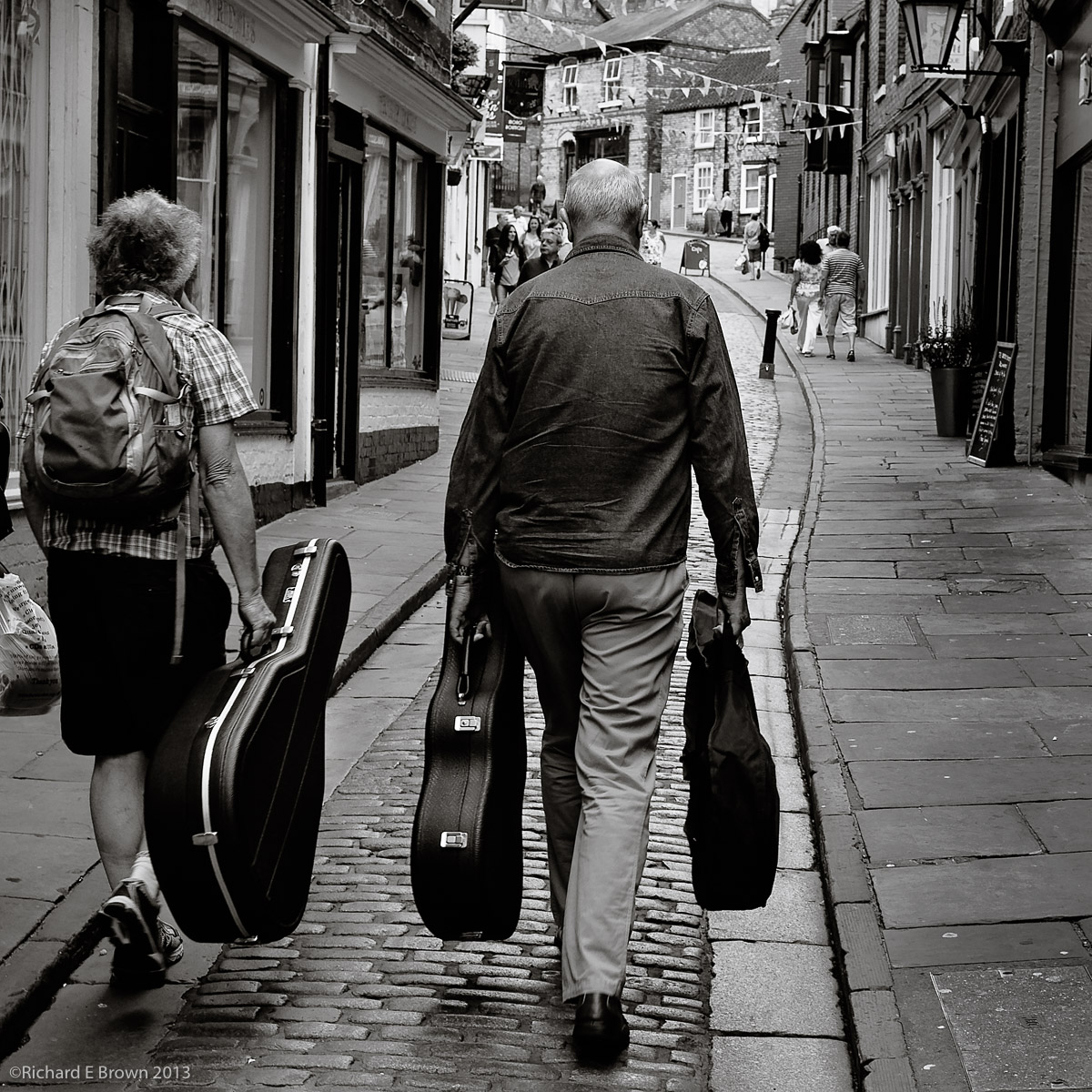
In the above photograph you have a basic flatly rendered JPeg, I have just added a crop to tighten up the image. I then ran it through my usual Adobe Lightroom work flow and I was pleased with the result but I still felt it lacked a little zing.
Postproduction in Lightroom
So I exported it as a tif into Photoshop CC to see what I could do with it in there. Now starting with a colour image there are at least four different ways to process an image to make it Black & White, including some very advanced techniques using LAB mode and also creating separate layers each Black & White based on the luminance values of each of the Red, Green and Blue Channels. All of which give very advanced control. Here through I just wanted the image to have a bit more pop and zing!
Dodge and Burn, Overlay method
First of all I thought I would do a little more dodging and burning to improve the local contrast of a few areas. Now the dodge and burn tool in Photoshop is not the best and can cause issues and colour shift. Not too important with a Black & White image but still there are better ways of accomplishing this.
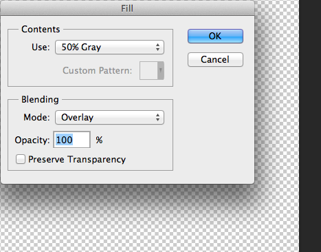
Now this technique is one that I learn’t from a printing tutorial by Jeff Schewe. Create a new layer and fill it with 50% Gray.
Now set the Layer mode to Overlay. Now to lighten parts of the image just paint on this lay with white (Dodge) and to darken parts of the image, just paint on this layer with black (Burn). Using a soft edged brush you can quickly and easily fine tune the image.
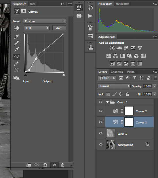
The next part is the contrast. I want the darker parts of the image to have a real boost in the contrast. I do this with a curves adjustment. While this has been possible in Lightroom since V4 it is more controllable in Photoshop.
Levels
For the dark portion of the image I have added two control points to steepen the curve and thus the contrast. I have added a third control point to bring down the mid-tones and return the highlights back to normal. For this image I felt the contrast in the mid-tones was still a little to high so I added a second Curves layer to bring it back under control.
I finished the image with a little sharpening.
So here is the finished image and this months “Picture of the Month”. I did try and reproduce this just in Lightroom but I could not get the same degree of control and the image lacked contrast.
 If your into printing then there is a hot and vocal debate on the use of OBA’s.