
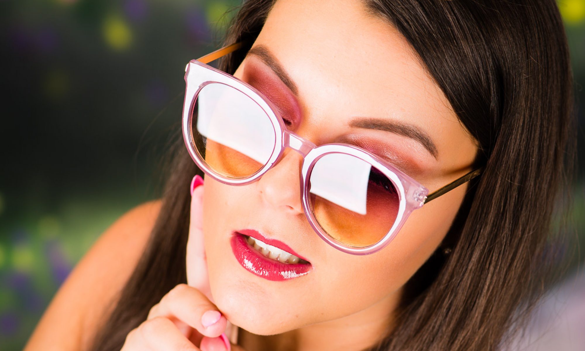
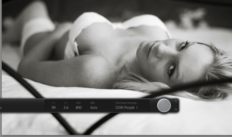
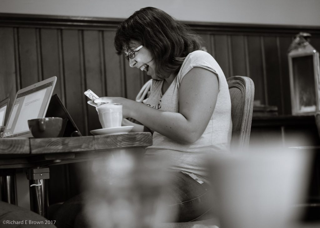
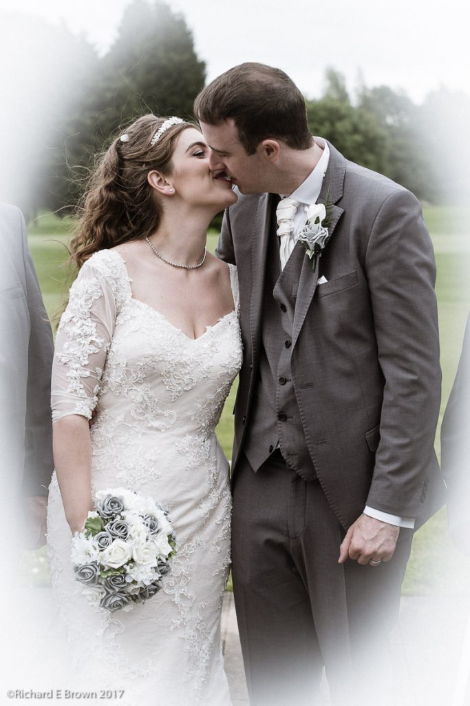
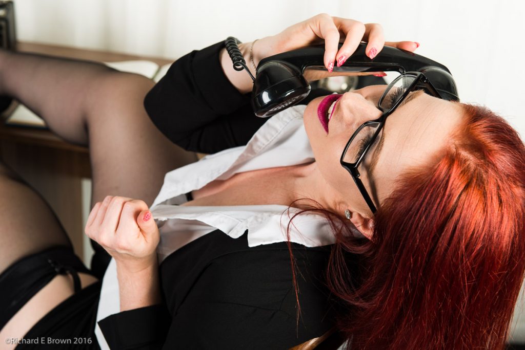
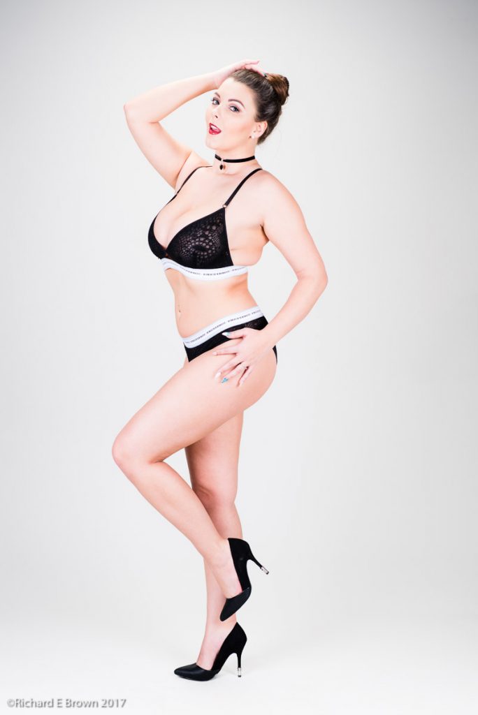
Sometimes a picture can just be a detail. When working with a model a hint of detail can be all that’s needed to create an erotic photograph.
Family, Photography and other misc news
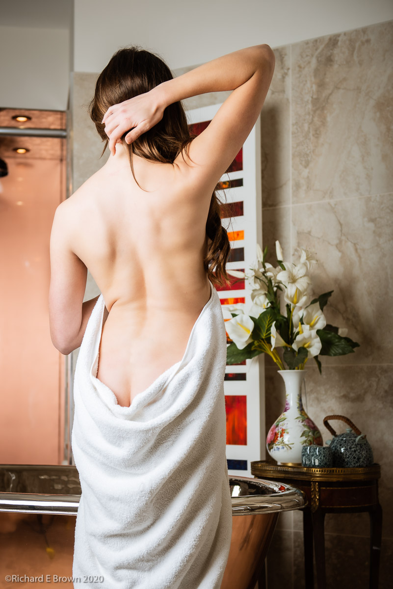
Sometimes a picture can just be a detail. When working with a model a hint of detail can be all that’s needed to create an erotic photograph.

All new Mac’s for a while now have had True Tone and Night Shift, but what does this mean for photographers.
For my main office MacPro and NEC Pro Reference monitor I have it all turned off, I have the screen calibrated with an X-rite i1 Display and I monitor the light in the room and have the profiler device adjust my monitor as I work.
My old laptop had no True Tone or Night Shift but now my new MacBook Pro 16 inch has all these new features.

First can I say that you should definitely switch off Night Shift, it definitely colours the screen and makes it warmer and more pleasing at night.
When it comes to True Tone then it is a little more complex. True Tone attempts to keep the colours neutral no matter what the colour conditions around you.
For general editing and producing pictures for my blog or for customer edit reviews then True Tone is not going to make a lot of difference. For my final edits that are going to be published or I’ll print then the edit should be done with True Tone switched off; but then I should not be making those final edits on my laptop but in my office where I have the tools to edit properly.
What flash to buy – Recommendations

Small flashes; well you cannot go wrong with your camera manufactures flash units. The Nikon units are particular good if expensive, which is the general problem with camera manufacturer’s lights.
For third party units I would recommend Metz or Quantum, there are a lot of new companies doing units now but I have no personal experience of them.
Studio flash units; low end I have no real experience but I will add that I had a cheap unit lighting the background on a studio shoot. It was struggling to keep up and caught fire! Midrange I use Elinchrom, high end the latest Profoto is hard to beat but you do pay a high price, I have heard some wonderful stories about how good their customer service is and assisting when there are issues.
Again like small flash, there are a lot of new companies doing studio flash like GoDox/PiXAPRO. The above shot was taken at a local location using some loaned PiXAPRO studio heads.
What ever you pick think about the accessaries you may need later and if its easy to get the unit repaired locally.
Mixing units; if you are doing anything that is colour critical then having all the units from the same manufacture help for consistent colour.
If your slowly building a system, may be a low-end light from the system you choose first, then add a second when you can afford it. This will last you a while, then maybe add a more expensive light as your main light and the others become background and hair lights.
Studio mains powered flash
This is where for most people it gets scared. How do you meter, using mutilple modifiers, just where do you start.
Well I would suggest watching a few YouTube videos as a start, then book a good local studio.
If you live in Lincolnshire, Nottinghamshire, then I would suggest you book Worksop Photographic Studio. The above shot was taken there.
Book the studio for a couple of hours and the house model and get a lesson on lighting. Many studios offer courses and you will learn a lot.
The key thing is to learn how to meter, and about soft and hard light, and specular and defused light.

The bigger the light source in relation to the model the software the light. Things like soft boxes give you more defused light then something like a beauty dish which being more direct and specular light source.
Moving a small flash off camera
So how do we get small camera flash better, well we move it off camera and use a modifier.
This picture here made using a small flash on a stand and a white umbrella, to trigger it I had my other flash on camera but set to remote mode so not actually contributing to the overall exposure.
In this shot we are mixing daylight with flash. This time I have gone up a level from small flash to portable battery studio flash. In this shot I used a Elinchrom Quadra on a lightstand and a shoot through umbrella. The advantage of a portable studio flash solution is that it offers far more power.
When using flash outside there is a problem, and that is power and sync speed. Power is easily solved, buy a more powerful flash unit. Sync speed is more of an issue.
In this particular shot I wanted the daylight underexposed. The flash exposure is controlled by the aperture, this leaves the only option to control the ambient light being the shutter speed. Low end cameras will only sync to 1/60 of a second. Mid range cameras will go to 1/125 to 1/180 and higher end cameras to 1/250. A high end professional studio medium format camera will sync up to about 1/2000 or some 1/8000 of a second but these cost tens of thousand of pounds.
On camera flash

On camera flash gives the worst result but there are ways of improving it. I highly rate Nikon’s CCS system, I use a pair of SB800’s now quite old but work well.
In auto using a cameras modern TTL flash metering system you generally get reasonable results, but they become easily tricked by large dark or white areas.
You get a bounce card with the SB800’s that helps and a little modifier, you can also buy little soft boxes to fit on the flash to improve things.
I generally use one flash on camera on low power giving some fill, with a second SB800 on a stand to the side providing the main light. In this shot above of Holly above, I think it was a battery powered Quadra on a stand providing the light with a shoot through brolly.
People argue over what is the best camera, the best lens, Canon, Nikon SLR’ no it has to be mirrorless. Fuji gives the best colour, no one can beat Sony etc, etc ad nauseam.
The one thing that is actually the most important is actually hardly ever discussed, and that is light.
All the above shots were taken in available light, some indoor some high contrast summer sun.
Most photographers like to work with available light, its easy but your somewhat stuck with what you have. Maybe a reflector for fill can help but if you want to raise your game then flash is the answer.

Whether its overpowering the sun with flash to take a photo of a flower in the garden or studio light on a fashion shoot, this with modern cameras, a histogram or some knowledge with a light meter gives controllable light; light that you can sculpt and shape the scene and your subject.
Flash seems to scare many photographers but to be honest there is no reason to be afraid. The easiest and worst is on camera flash. All photographers at some point have tried it. Flash on camera, harsh direct light and often red-eye on the subject. Not pretty. The flash goes away never to be used again.
But move the flash off camera, start to understand the relationship between size of the light source and its affect on hard and soft light; and a understanding of defused and specular light sources and you can take control of the light around you.
So how do you learn this, well there are a lot of good educators on YouTube
I particularly like ‘Daniel Norton Photographer‘. If you want some out of the box thinking on flash, especially small flash the Strobist website is a good place to start.
Lens are a very personal thing. For street photography a focal length of 24mm to 50mm is the most useful, followed by a short telephoto.
If I had the Leica CL then I would have two lens, the 23mm f/2 Summicron which gives a field of view of 35mm, and the Leica APO-Macro-Elmarit-TL 60mm giving a 90mm field of view.
So now for studio work.
The Hasselblad X series lens light up is still being expanded upon but there are two portrait lens that interest me, the 90mm f/3.2 giving a field of view of around 70mm equivalent for 35mm, which is a little short for head shots, and the 135mm f/2.8 which gives a field of view of 105mm for 35mm format.
With medium format and 50 MP giving a lot of cropping potential it would be tempting to go with the 90mm and cropping a little for headshots, but it depends on how much room you have in your studio and your budget. The longer lens is £1100 more a big step.
I would go for the 90mm and make it work.
As I said before this is a very personal selection and one where money has not really be considered so more a flight of fancy with the more expensive choices.
Studio Photography
A studio gives you controlled conditions, heavy cameras are not an issue but large maluble files useful for post production are essential.
High on the list must be the Sony A7RIV at 61 MP full frame 35mm sensor its a technical tour-de-force, up there must also be the Nikon D850 and Canon 5D. The new Leica SL2 must also be on the list.
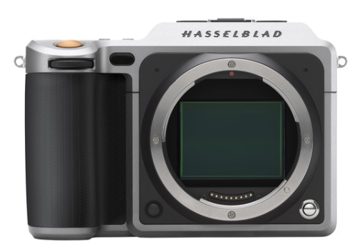
As this is the studio then lets think big and consider medium format.
Lets first consider the big players; Hasselblad and PhaseOne.
Your talking big money, and even though this is a flight of fancy. While a bottom of the range Hasselblad H series starts around £14,000 and for 100 MP its over £30,000, lets me a little more reasonable and consider the Hasselblad X and the new Fuji range.
The new X series Hasselblad, the X1D II at a little over £5399 is quite a camera and the colour is unmatched, the flash sync up to 1/2000 and a degree of weather sealing should one want to take it out.
The Fujifilm GFX range has really set the world alight. A, for medium format affordable system. The S and R have the same sensor as the Hasselblad X, an older sensor without the outstanding colour of the Hasselblad but the price is hard to beat, but a more limited flash sync. The R at under £3,000 and the S at £4500 are tempting in the extreme, but the new GFX 100 with a newer sensor at £9500 is outstanding.
What would I pick, a tough choice, it would be between the Leica SL and the Hasselblad X. With my previous choice being a Leica, being able to have the same lens mount between the two would make life easy and its a very modern sensor compared to the Hasselblad, but the draw of a medium format lens and the advantages of the bigger sensor is tempting.
I think I would pick the Hasselblad.
This is going to a highly personal selection and I expect most people to disagree with me.
If I was starting in photography budget not being a concern what would I buy. Well I am going to limit this initially to the two areas that most interest me, street photography and studio portraiture.
Street Photography

Street photography if fixed lens compact then you have a large choice. The little DX crop Ricoh, Fuji X100, full frame Sony RX1 and the full frame Leica Q would be the cameras I would look at.

If I was after a camera with a little more flexibility, then I would go for Olympus Pen or Leica CL, both very flexible interchangeable len cameras, both being smaller crop factors so giving greater depth of field making zone focus easier.
So what would it be? I think for the flexibility I would pick the Leica CL a little DX crop format camera.
So what about studio work? Well I’ll address that in a few days.