I have a love hate relationship with my Nikon V1, it suffers from a number of issues, poor ergonomics, image review you can not turn off, and the sensor for switching between the back screen and EVF has a habit of not working.
On the plus size, for the sensor size the image quality is great, the camera and lens are small and compact and I can carry a large system in a very small bag and for me the build in EVF is very usable.
The Nikon One series has some of the fastest auto focus of all mirror less cameras so is well suited to some tricky subjects.
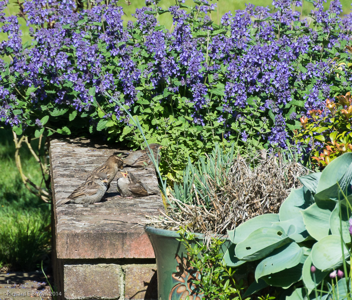
We have a lot of wildlife in our back garden, lots of birds from Robin’s, Gold Finch, Green Finch, Tree Warbler as well as lots of House Sparrows, Black Birds, Pigeons and even Pheasants.
I spotted this adult House Sparrow feeding its newly fledged youngster. I quickly grabbed my Nikon V1 with the 30-110mm lens, this makes it a 300mm lens in 35mm photography terms so if great for this kind of shot.
I generally use the Nikon V1 as a compact, but due to my frustrations with the viewfinder and ergonomics I have been thinking of replacing it with either a Ricoh GR (fixed 28mm lens), or a Fuji X100s. I have even considered the Leica T as I could also use it as a spare body for my Leica glass.
But days like this the camera shows its strengths, and Nikon are even planning to launch a zoom with the 35mm equivalent reach of 800mm, its going to be expensive at around £800 but for that kind of reach a real 800mm lens would cost many thousands of pounds.
So my Nikon V1 may well stay around for this kind of thing a little longer for when I want good reach in a small system, but its days as my carry everywhere compact are numbered.