
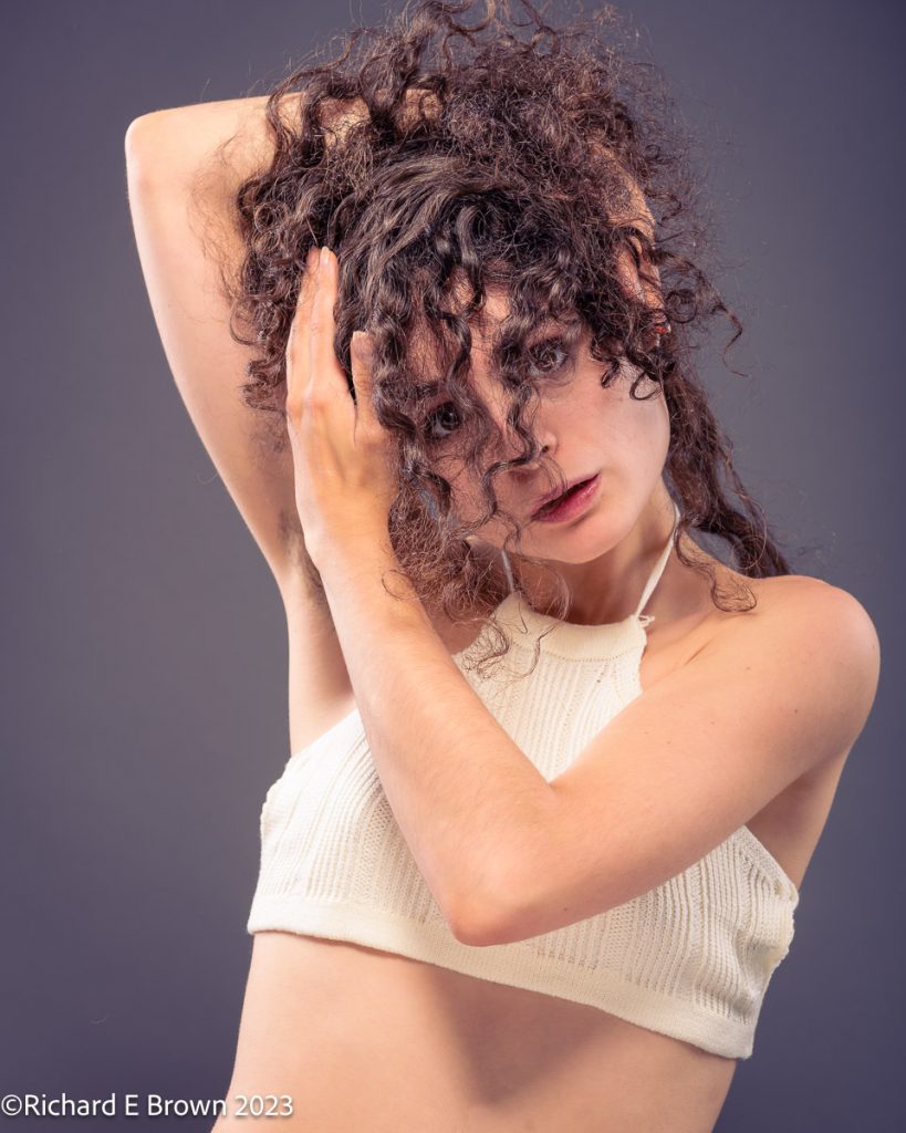
Colour grading can be noticeable but not over the top like in this shot of Jasmine.

Again in this photograph of Helen, I have been quite heavy with the colour grading but it’s still reasonably natural looking. The eye excepts it.
Sometimes its fun to just go crazy.

One can also use tints to match clothes to give a overall colour theme.
Play and have fun; if using destructive editing techniques then work on a copy, or if working non-destructively, like a product like Adobe Lightroom