

Colour or Black & White?
Or shall we say what colour?
In cinema, colour grading is a big thing to give a mood to a scene. If you watch the matrix movies the colour grading for the scenes in the matrix and outside in the ‘real’ world are very different.
I do occasionally colour grade some one off images but rarely.
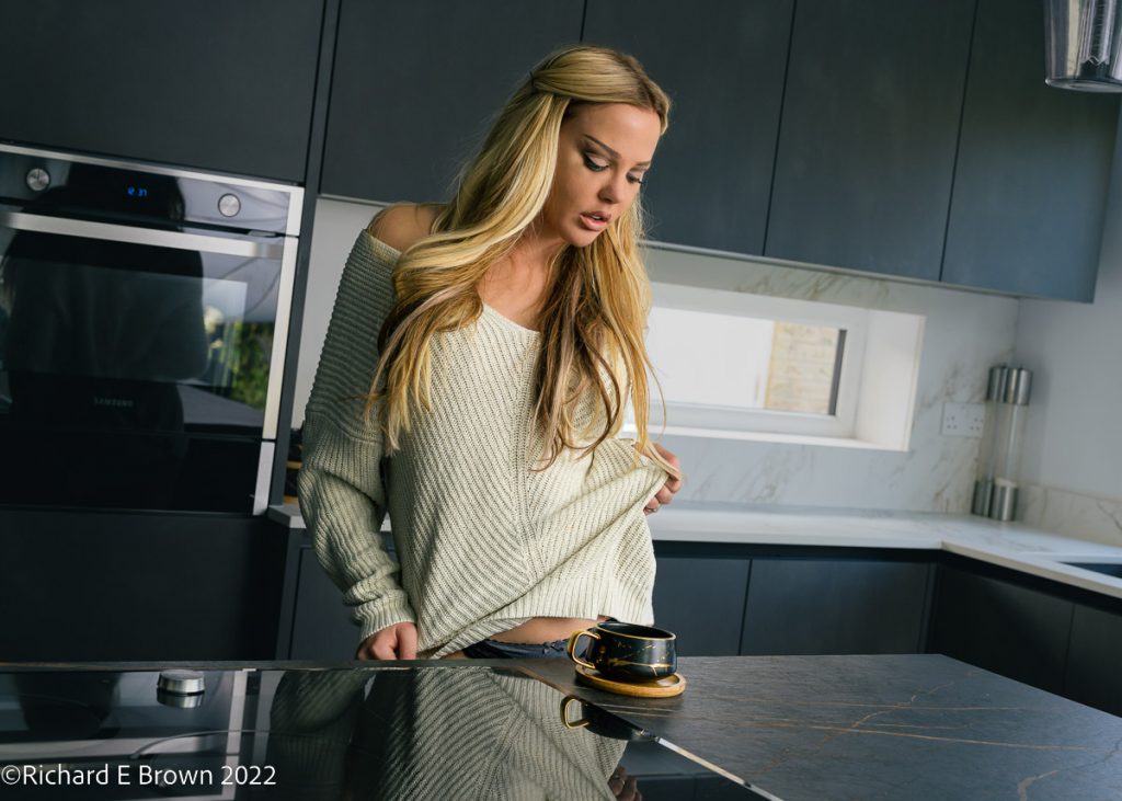
But for my last shoot of last year, a lifestyle, and lingerie set, I did some extensive colour grading. The smart modern kitchen set suited it well so I toned the shadows a steely blue, while just giving the highlights a hint of extra warm tone.
With one set of images I combined some in camera work with post. This image above has the cool colour grading of the first but I also used half CTO on a small soft box. The majority of the light in this image is from a large shoot through umbrella, there is then a small soft box with a orange gel on it, to give the warm sunlight look.
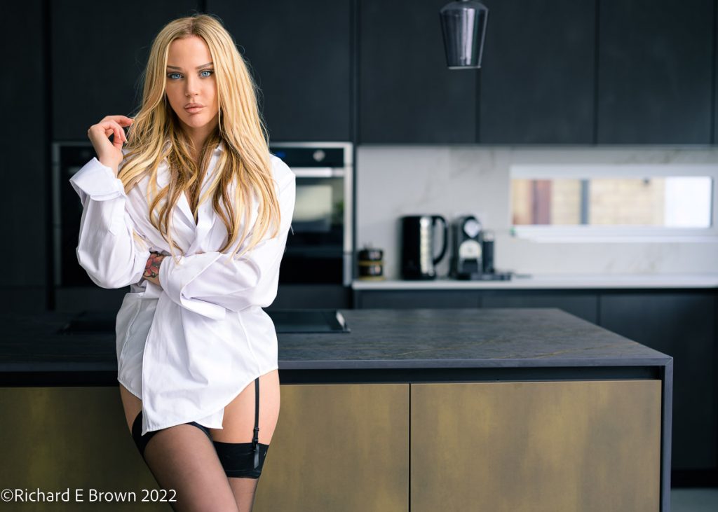
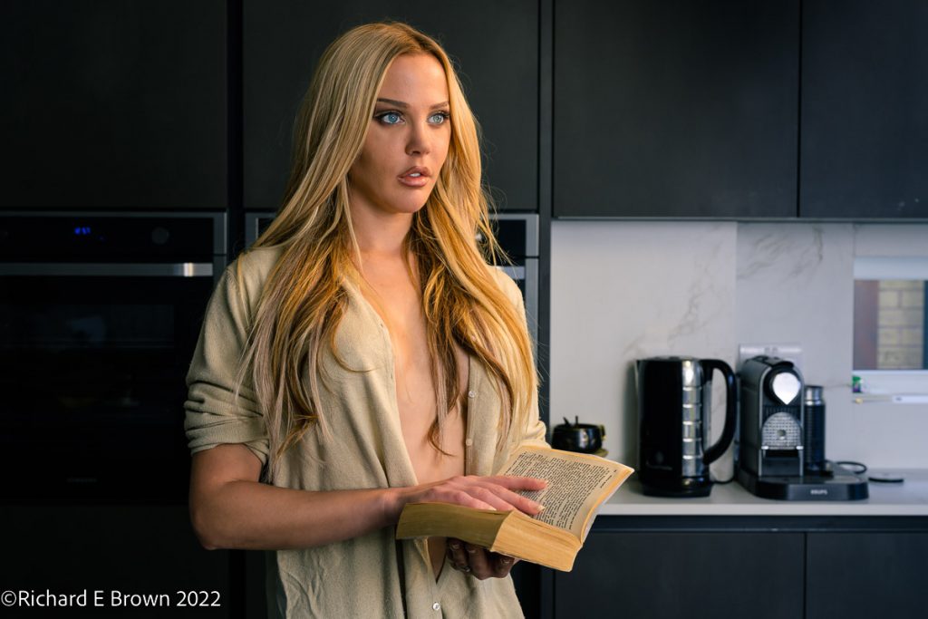
With these first two images the colour grading while noticeable is relatively subtle. In this image above the colour grading is more more obvious, its selective colour saturation and grading which gives it a monochrome look.
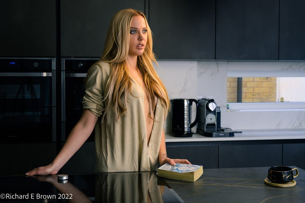
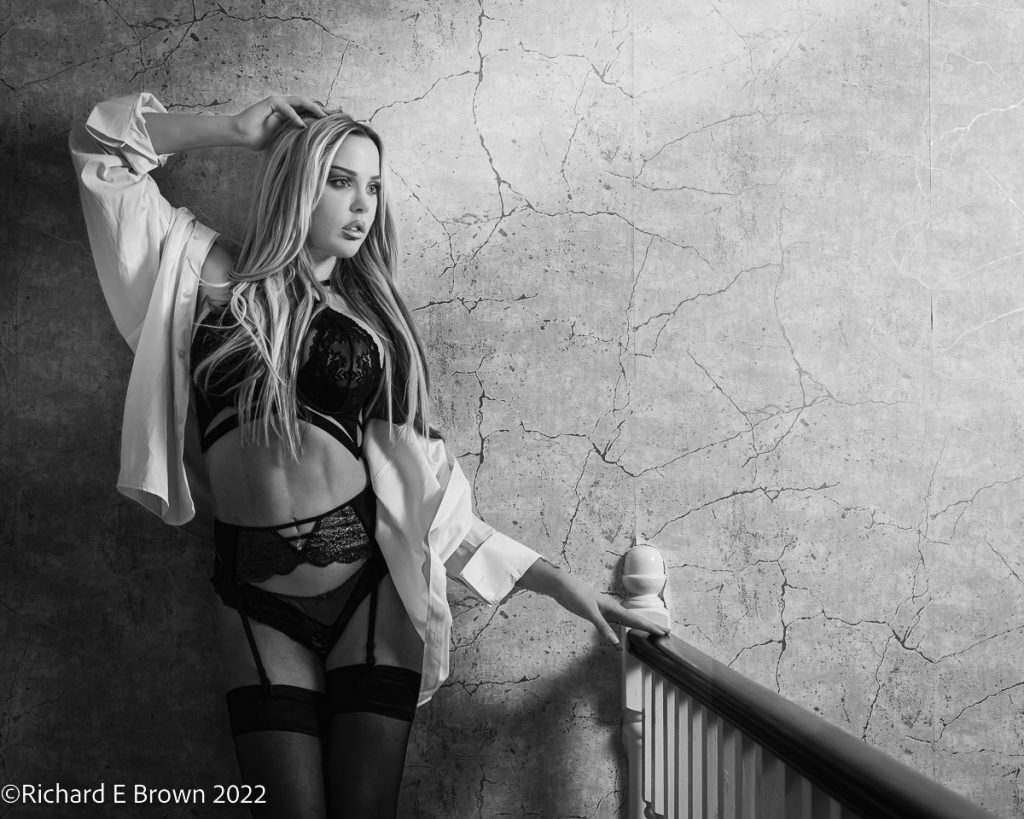
Lastly a standard black and white image. Even with this, using digital capture there are lots of options available. The image is still made up of the three colour channels and by changing the amount of each and their ratio to each other you can dramatically change an image.

A vintage look. What would you have done?