
Leica M8
Leica 50mm f/1.4 Summilux-M
50mm, 1/90 Sec at f/2, ISO640
Post Processed in Adobe Lightroom V5.4
On a MacBook Pro, OS-X 10.9.2

Family, Photography and other misc news
Leica M8
Leica 50mm f/1.4 Summilux-M
50mm, 1/90 Sec at f/2, ISO640
Post Processed in Adobe Lightroom V5.4
On a MacBook Pro, OS-X 10.9.2
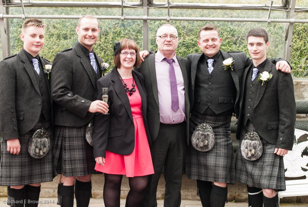 This weekend was my eldest brother’s, youngest son’s wedding. It was held in Aberdeen and with half the wedding group being Scottish then it was everyone wearing their best kilts.
Bob my eldest brother could not be persuaded to show off his legs but the rest of the Brown’s on that side of the family were persuaded.
Altogether a great weekend.
 With all this talk about the fantastic Fuji X-1T, the new unibody got to have it Leica T, and my absolute need for a carry anywhere has an optical viewfinder Fuji X100s lust; I now have a very bad case of GAS (Gear Acquisition Syndrome) .
For me some cameras are a must have. My large format Ebony and my medium format Hasselblad are not just cameras but objects I love owning and using, they bring a real pleasure to me in using them.
My Nikon digital SLR’s are working tools, real goto tools when I have to get the image. With macro gear, flash and lens ranging from 12mm to a fast 300mm f/2.8, there is no job I cannot do. Or feel I can tackle with confidence. But while the Nikon gear is very good it does not inspire me the way my Ebony, Hasselblad and Leica’s do.
This weekend I had the chance to overcome my GAS, with a very enjoyable family wedding in Aberdeen, Scotland.
Being a guest and not the photographer at a wedding for a change, it was nice to relax and enjoy. I wanted a camera to inspire me, that had great image quality but was small, light and would not get in the way.
It had to be the Leica M and I picked just two lens, a 35mm Summicron and a 50mm Summilux. Simple and light.
The professional photographers booked for the wedding all had Canon 5D’s an excellent choice for a wedding and a fantastic tool, they all came over to Ooh & Aahh over the Leica. The first photographer asked was it a Fuji then almost dropped his 5D when he saw the Red Dot.
My Leica’s always attract positive attention from other photographers yet are unnoticed by the general public.
Enjoying such a simple setup really makes me think do I need another camera, and if I did what do I want from it that my other cameras cannot do.
It would be a replacement for the Nikon V1, be a small grab and go camera when I don’t want to take a bigger camera with me, but in a number of ways that is what my current Leica already is. So do replace the Nikon V1 with a Fuji X100s or Leica T, or actual replace it and the Leica with a weather sealed Lecia M 240. The T is a budget Leica but can be a spare body to my current M8. I would have to add the EVF and adapter which would drive up the cost. The Fuji X100s does not seem to fit in here, it’s very like the Leica M, but has a fixed lens. It’s advantages are the viewfinder and it’s leaf shutter making daylight flash very simple.
So while this weekend has weakened my GAS it’s certainly not cured it.
Well its been announced and several photographers I trust have released reviews.
First a comment to the Leica Haters, get over it. There are lots of cameras to choose from, for some of us; we shoot Landscape on our Large Format 4 x 5 inch film Ebony’s, for others they use their Smart Phones and both sets of users are happy.
The best hater comments I heard was that it was a rebadged about to be released $99 Samsung running Android or a re-badged Sony Nex-5.
For a German built Leica I throughout the price was very good, yes its expensive but this is built far better then the competition. While I prefer direct controls like the Leica M and the recent Fuji X range, Leica should be applauded for trying a different control layout. While we have had touch screens before, nothing quite like this has been seen on a camera.
First the good; image quality is up there with the very best and the build quality head and shoulders above the rest of the pack but then so is the price.
Down side, no bracketing no exposure lock, no built in viewfinder, no optical image stabilisation, Leica feel currently that in sensor or optical stablisaton impacts image quality too much.
I could go on but the best option is to check out the review sites.
Lens wise things are a little limiting so far but there are two other lens to follow early next year, the Leica Super-Vario-Elmar-T 11-23 /f3.5–4.5 ASPH, and the Leica APO-Vario-Elmar-T 55–135 /f3.5-5.6 ASPH. These are 17–35 mm and 80–200 mm equivalents in 135mm terms.
While we might make the same complaint about the current zoom as was made with the Lecia X Vario, that it is too slow, you cannot fault the quality. Unfortunately due to the laws of physic that even Leica cannot get round you can have lens that are small/high-quality/fast – pick only two.
So the big question, would I buy one, honestly I do not know. It would make a good replacement for my Nikon V1 and act as a spare body for my Leica glass. The current limited lens range would not impact me as much as I have several Leica M lens I could use. It would not though be my carry everywhere compact camera. The lack of direct controls and a viewfinder would be too limiting for me. I think for me the Fuji X100s is a better everyday choice but I have to admit I could find room in my Leica bag for one of these, the EVF, and mount adapter and I am sure many other Leica M users could as well.
With its modern controls it will be a camera that splits photographers, for those that can see beyond the price and remember that Leica are a tiny company without the scale of production to bring down prices like the Panasonic’s/Olympus/Fuji and Canon/Nikon’s of the world its worth considering.
One last interesting thing is the mount diameter, its very large and would cope with a full 35mm sensor, is there a Leica T Pro waiting in the wings!
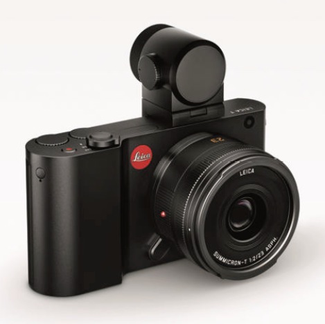
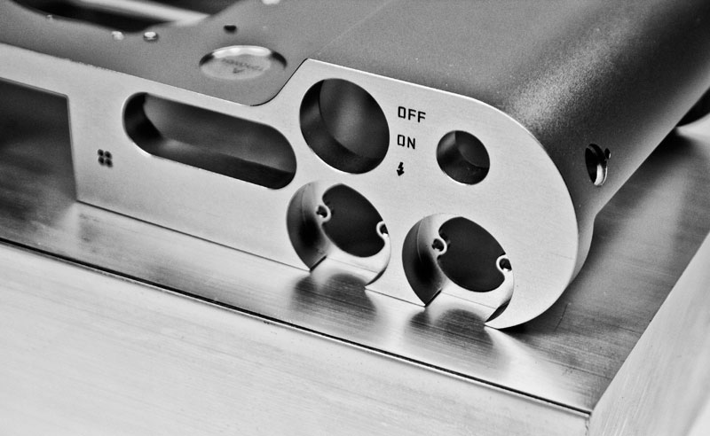
This afternoon for us in the UK Leica make their press announcement and its now about definite that the announcement is going to be the new Leica T 701.
It is looking like a standard mirror less, none viewfinder compact system camera with a fancy touch screen, and with the ability to take Leica M glass as well as a new range of autofocus Leica T glass.
For most its likely to be too expensive and not offering anything that a Sony NEX or Fuji X camera cannot do better, but for those of us with Leica M glass its worth a serious consider as it will support coding on modern M glass and correct vignette and colour drift.
As I am publishing this before the announcement the above is conjecture but I believe will be accurate from the rumours so far leaked.
Its also going to integrate with the iPhone and iPad like many other recent mirror less releases and the iOS app has already been released.
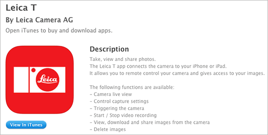 According to Leica it will:
Camera live view Control capture settings Triggering the camera Start / Stop video recording View, download and share images from the camera Delete images.
We are now less then a week a way from Leica’s press conference, those hoping for a real mini Leica or an interchangeable Leica X are all holding their breaths in excitement.
It now looks like its going to be a APS-C sensor, interchangeable lens mirror less camera. The big thing for me is whether its going to have a built in viewfinder.
The rumoured price is $3000, with an optional EVF, but there will be an optional adapter to take Leica M glass so it may be a cheap (in Leica terms) spare body for us Leica M users.
Is this all true or is something else going to be announced; well we will all find out on Friday.
Jeremy Clarkson remarked recently that gardening was a pursuit of the old who are waiting to die, well I suppose that means I am now old. Over the last few weeks we have been building our raised beds and tidying up the garden to suite our needs.
This bank holiday weekend we have been concentrating on the raised beds which we built over the last few weeks. Its been hard work but they are nearly finished and we have been digging over the soil, and sorting out are seed trays in anticipation.
Despite the the hard physical work its been very satisfying.
 Quite a while ago now, back in 2012 I think, Adobe announced lossy DNG. Like many photographers I did not see the point but now that Adobe Lightroom Mobile has been released it makes more sense.
You see when you select a RAW file to sync from your desktop you don’t get the large RAW file synchronised across to your iPad, or a jpeg that with its 8 bit compression is easy to break when editing.
To quote Adobe
Its this lossy DNG file that gets transferred to your iPad and its that you are working on. In this scenario it makes a lot of sense.
With cameras regularly producing RAW files over 16 MP now even 24 MP now common and the top end cameras at 36 MP, it would be useful if camera manufactures started to use lossy DNG. When you want a file smaller then RAW but still with the ability to edit more flexibly then a jpg it makes sense.
I suspect some camera manufactures like Ricoh and Leica may adopt it but the Canon and Nikons of the world will either keep offering RAW/JPG or offer their own proprietary lossy RAW format.
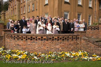 The wedding season has truly started and we are now getting booked up for 2015.
I enjoy the odd wedding but only do a few a year to stay fresh, if you do to many I feel it becomes a chore and not something to enjoy. I feel the key to photography is always do something you enjoy.
There have been rumours of a Leica mirrorless camera for a while now. Of course the Leica M is a mirrorless camera but we tend not to count that, by mirrorless we tend to think of Panasonic/Olympus MicroFourThirds cameras, Sony NEX or Fuji X range.
Leica have pretty much stated they have a mirror less camera coming but very little news has slipped out, but finally as the Leica press conference scheduled for April 24th gets closure more leaked pictures start to appear.
For those of us wishing for a built in EVF and it taking Leica M glass, then we are likely to be disappointed but even if its not the camera I want, I am looking forward to what Leica are about to release.