As with still cameras which have steadily increased in resolution, with have seen TV’s continually step up in recent years.
From CRT TV to Flat screen, then HD; in our consumer society there is always a need to make people upgrade. 3D was the next big thing, but while moderately successful in movie theatres was less so in homes. Now we have the next big thing 4K which has 4 times the resolution of HD.
I suspect we will see still cameras with 4K soon, we have already seen some mobile phones with 4K but I expect thats more marketing over usability.
One interesting aspect of this is going to be what happens with media and to broadcast. While Blue Ray can cope its likely we will need an updated format as we are close to its limits and that leaves no room for extras. Broadcast is even more of an issue, we would loose the majority of our channels as there is insufficient bandwidth to deliver 4K channels in the current numbers.
Interestingly Sony have come up with an interesting answer. Last year there first 4K TV coast $25,000, this year the current model is $5000. For deliver of content they have released a 4K media server at $700. Movies can come on either SD card or by download.
For many physical media is a thing of the past and it seems 4K may mean that for movies as well.
If you are interested in seeing some of the new features in Adobe Lightroom V5, B&H together with Scott Kelby have put together a free video available on line here.
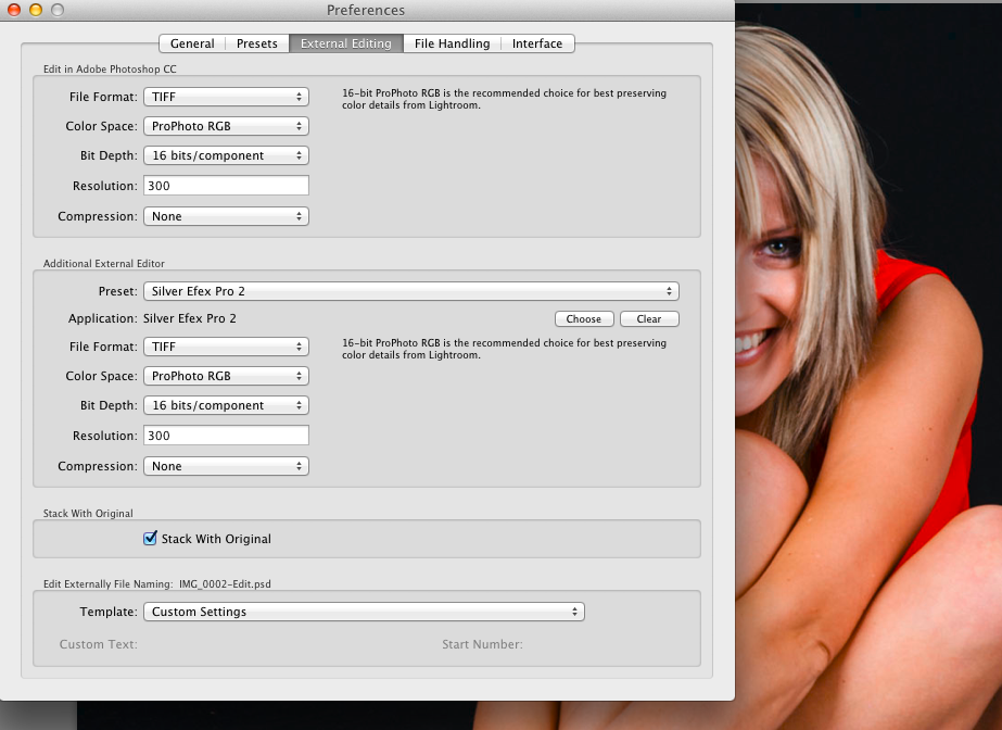
Where possible I have tried to standardise on as few post production software packages as I can.
The majority of my work is all done in Adobe Lightroom but sometimes you need either the added power of a third party plug-in or application or its just easier to do in some packages.
I feel its better to be a master of one package and try to do as much as I can in it.
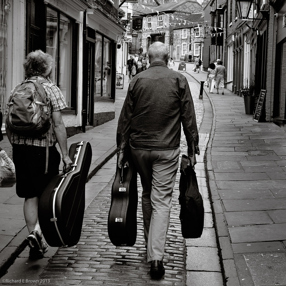
In the above photograph you have a basic flatly rendered JPeg, I have just added a crop to tighten up the image. I then ran it through my usual Adobe Lightroom work flow and I was pleased with the result but I still felt it lacked a little zing.
Postproduction in Lightroom
So I exported it as a tif into Photoshop CC to see what I could do with it in there. Now starting with a colour image there are at least four different ways to process an image to make it Black & White, including some very advanced techniques using LAB mode and also creating separate layers each Black & White based on the luminance values of each of the Red, Green and Blue Channels. All of which give very advanced control. Here through I just wanted the image to have a bit more pop and zing!
Dodge and Burn, Overlay method
First of all I thought I would do a little more dodging and burning to improve the local contrast of a few areas. Now the dodge and burn tool in Photoshop is not the best and can cause issues and colour shift. Not too important with a Black & White image but still there are better ways of accomplishing this.
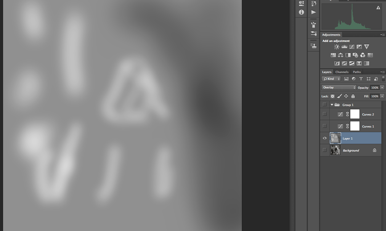
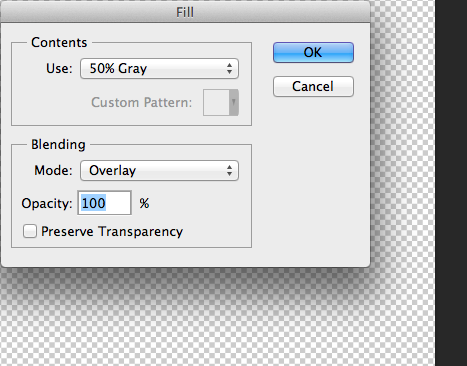
Now this technique is one that I learn’t from a printing tutorial by Jeff Schewe. Create a new layer and fill it with 50% Gray.
Now set the Layer mode to Overlay. Now to lighten parts of the image just paint on this lay with white (Dodge) and to darken parts of the image, just paint on this layer with black (Burn). Using a soft edged brush you can quickly and easily fine tune the image.
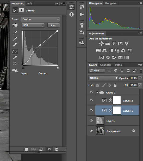
The next part is the contrast. I want the darker parts of the image to have a real boost in the contrast. I do this with a curves adjustment. While this has been possible in Lightroom since V4 it is more controllable in Photoshop.
Levels
For the dark portion of the image I have added two control points to steepen the curve and thus the contrast. I have added a third control point to bring down the mid-tones and return the highlights back to normal. For this image I felt the contrast in the mid-tones was still a little to high so I added a second Curves layer to bring it back under control.
I finished the image with a little sharpening.
So here is the finished image and this months “Picture of the Month”. I did try and reproduce this just in Lightroom but I could not get the same degree of control and the image lacked contrast.
For a while now if you bought a Leica you got a free copy of Lightroom V4. Leica have now made there expected announcement that all new cameras, whether a re-badged Panasonic to a Leica M or Leica S, will come with a license for Lightroom V5.
Whether you have the latest SLR’s and big fast glass or a basic compact, with its mix of static displays and flight demonstrations, there is plenty for everyone to photograph. One common disappointment is that often the photographs come out too dark. Shooting into the bright sky can fool many light meters. Back in the old film days I would switch to manual and take a reading from a grey card I would place in front of me to meter off. The same light falling on the grey card was also falling onto the aircraft and this would give me a good basic exposure.
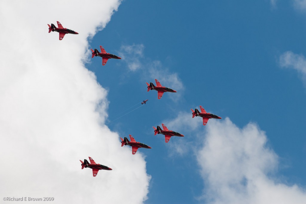
In case your wondering about the shot above, its a rather poor composite of two different shots I took when the Red Arrows flew over Lincoln. A bit of fun you might say in Photoshop.
It was a bit of a surprise considering that version 5 is now out but an update appeared the other day for version 4 users; version 4.4 was updated to version 4.4.1, mainly a bug fix but still nice to know V4 users are still getting some support.
For those of you who shoot jpeg, do not edit in post and send your images off to typical print shops, then you probably just have your camera set to sRGB. sRGB is a very limited colour space and cannot show as many colours as modern printers can print. Its the typical output of a standard cheap monitor. In fact many high end displays can only display sRGB, but it is most cameras default setting, and what most print shops assume your camera is set to and what the file is set to.
If you are interested in producing the best output possible then you need to set your camera to AdobeRGB, this colour space can show more colours.
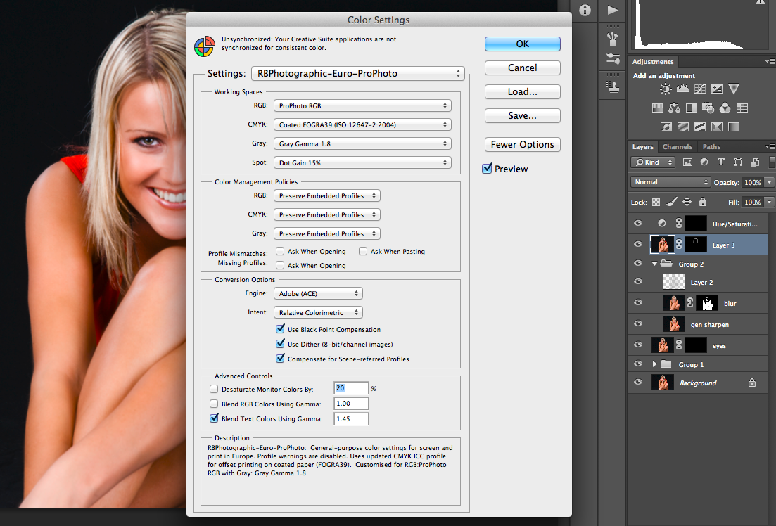
When editing even AdobeRGB cannot handle as many colours as your camera may capture or in fact what a high end pigment printer can print. If you are after the best results then you want your working space to be ProPhotoRGB.
Recently I upgraded by computer by installing an SSD, best upgrade ever and now my four year old MacBookPro is as fast as when I originally bought it even running the latest software.
I decided to do a fresh install of my applications. Unfortunately this caught me out recently, when I discovered some of my recent edits have not been quite as good as they could have. Unfortunately some of the defaults for Adobe Lightroom and Adobe Photoshop are less then optimal.
Now Lightroom is very good; you cannot actual set a working colour space, it uses its own created by the main developer but it can be considered to be similar to ProPhoto, the difficulty is if you export it to a third party program, if the third party program will accept it you need to set the Colour Space to ProPhoto RGB, by default Lightroom will export it as sRGB in 8 bit. This can be limiting and can cause issues with banding and artefacts appearing in finished image.
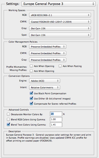
In Photoshop you get to the colour settings by pressing Shift-CMD-K. I would suggest you start by choosing either Europe General Purpose 3 (for Europe) and America General Purpose 2 for the USA.
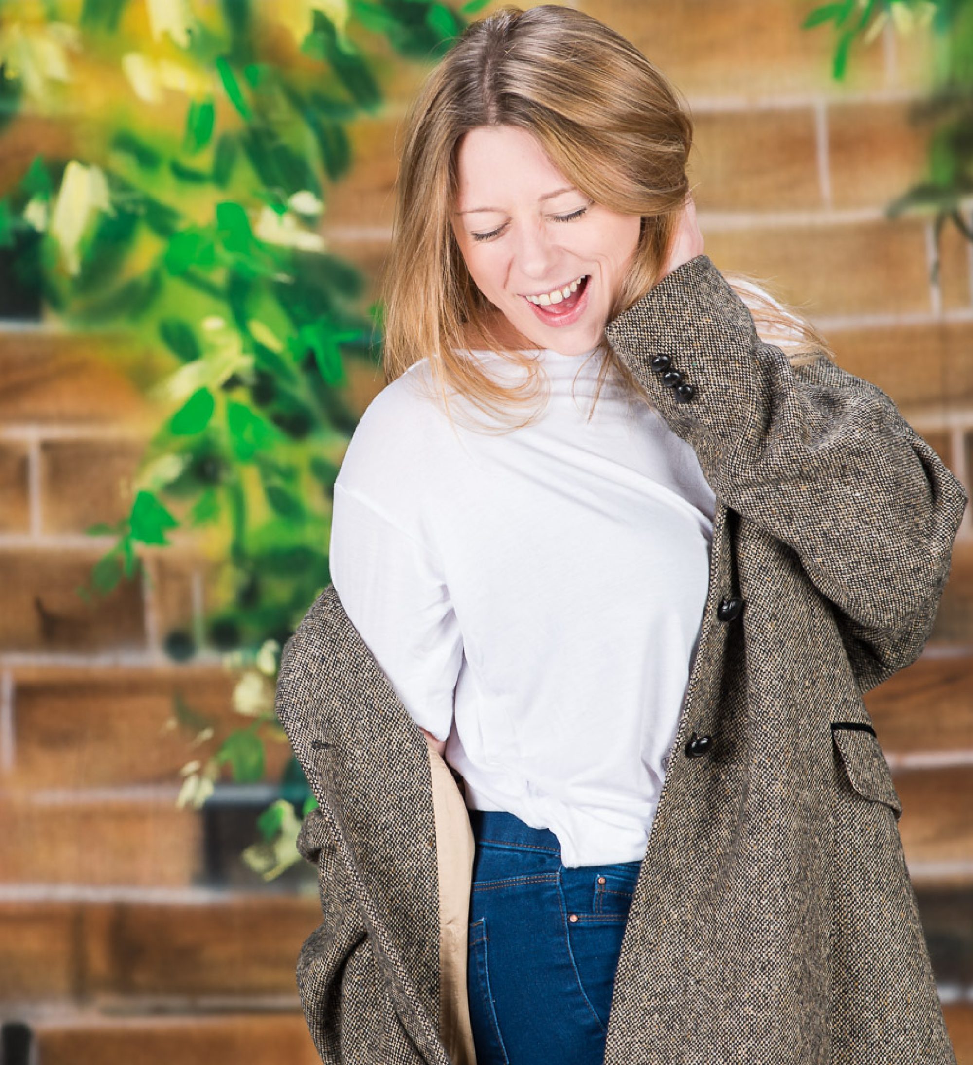
As you can see the default is sRGB which needs changing to ProPhoto RGB, Gray wants setting to Gamma 1.8, yes there is a Grey Colour Space which consists of shades of Grey! Once these are set to your likings then I would suggest you save it. If your copy of Photoshop does not show as many options as above then have a look to the right, there is a button marked more options. Press this and more options will appear.
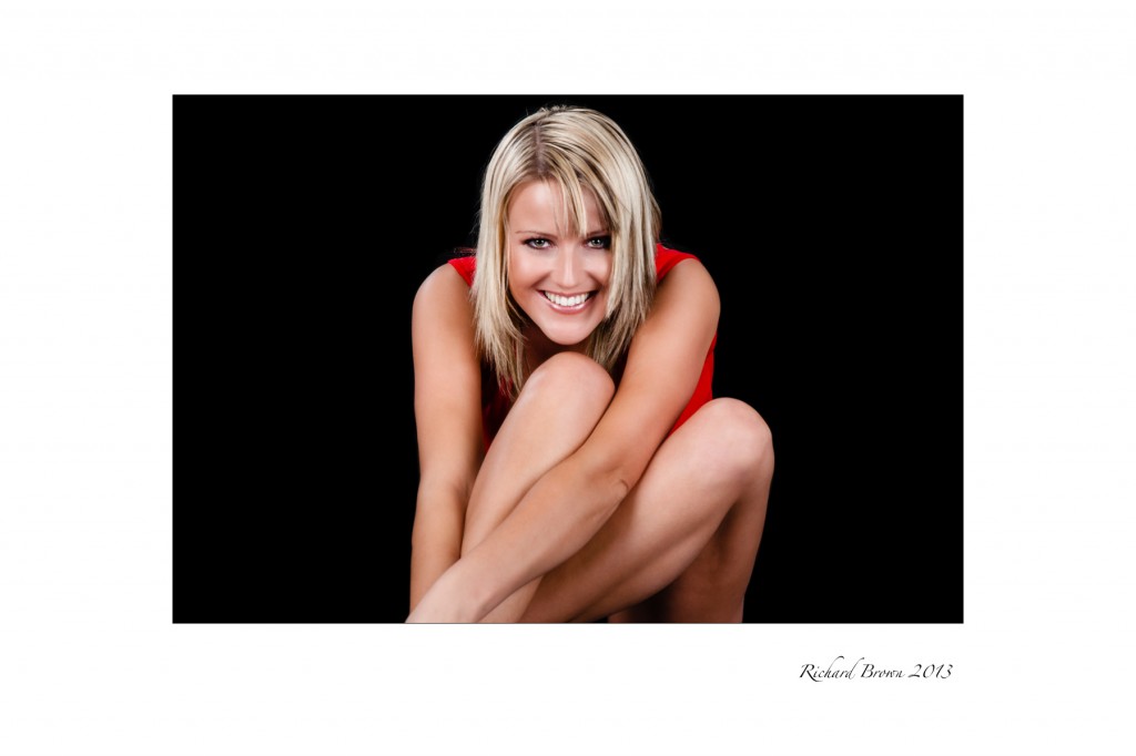
So is this extra effort worth it, well it only needs configuring the once so its not really any extra effort but i’ll let you be the judge, here is the final edited picture of Lisa.
In case you are wondering this image as been converted back to sRGB to be put on the web. Many web browsers cannot cope with anything else then sRGB and do not support colour management. It is getting better as Safari and Firefox now both support colour management.
Its an old Argument on the forums but JPeg seems to becoming more popular again, but why? Well in Camera processing is a lot better then it used to be, and the connivence and ease that it gives certainly speeds up the workflow.
Once the photographs are imported into my DAM Package (Digital Asset Management) they then have meta data and keywords added to them. Even with import scripts and presets it is still quite a bit of work. Its worth it though as anyone who has been approached by a buyer who wants to purchase the high quality original to the small jpeg you have placed on Flicker or your Blog will testify. Being able to quickly and easily find your work, a week, a month or even five years later can mean money in the bank, and not being able to find it a lost sale. Keywording and adding Meta Data to your photographs is essential to any semi or full time professional photographer.
But back to the original question; what about editing and post production?
Out of Camera JPeg
The above two pictures show a edited RAW file followed by the out of camera jpeg.
Some of the in camera jpegs do look a lot better then the raw files imported into your favourite raw processor. It is a complaint that a number of photographers make. The image they see on the back of their camera is nothing like the RAW image they see after importing into Adobe Camera RAW/Lightroom. What a lot of people don’t realise is that modern RAW software is designed to give a basic flat image. It is then up to the Photographer to take that image in the direction they wish to go.
My out of camera jpeg is certainly not as good as it could be, there are lots of in-camera settings to improve things, but what people don’t realise is that the histogram is based on the in-camera JPeg. So if you tweak the JPeg you are altering the display of the histogram. Currently only the Leica Monochrom can display a real histogram based on the RAW file. White Balance also has a major impact on the histogram. I try to have my JPeg settings configured to give me an accurate as possible histogram. In the above shot my White Balance is out due to the complex mixed light source, if I had got this right in camera then the JPeg would have been better.
So the top image has had a lot of tweaks and adjustments made, while the second image is just an out of camera JPeg. Is the added work necessary and worthwhile?
Well this example may be a little extreme, the lighting was mixed light sources, the contrast high and the exposure difficult. I got the shot wrong in camera but as I shot RAW and JPeg, I had the RAW to fall back on. RAW files can be edited far more then a small 8 bit JPeg.
For an outdoor street scene the in-camera jpeg and processed RAW would likely look the same, in fact the JPeg would highly likely be better. In that situation one would likely say that the extra work involved in shooting RAW is not worth it, and I would likely agree.
But what about in this example. The out of camera jpeg is reasonable, but by editing the RAW file, applying a simple preset and then a minor adjustment with a bit of additional burning and dodging, the image pops that little bit more. But is the extra work worth it? I suppose it depends on the image and the end result.
JPeg from RAW no Editing
Get it right in camera and if your intending not to do any intensive post production then the JPeg will be fine. If your not sure you are going to get it right in camera or are going to do a lot of post production then shoot RAW.
So what do I do? Well I tend to shoot RAW and JPeg, but I have the JPeg set to Black & White. That way in Lightroom I see images side by side, one colour (the RAW file) and one Black & White (the JPeg), I can then see at a glance which I prefer, colour or Black & White.
For personal work JPeg is a good option but while many currently professionals are saying that they use Compact Mirror-less Systems and shoot in JPeg it should be remembered that for their commercial work they are often shooting RAW on Medium Format, then at the end of session are shooting some personal stuff on mirror-less in JPeg and posting straight to their blog. One is given the impression that Pro’s are now all shooting that way.
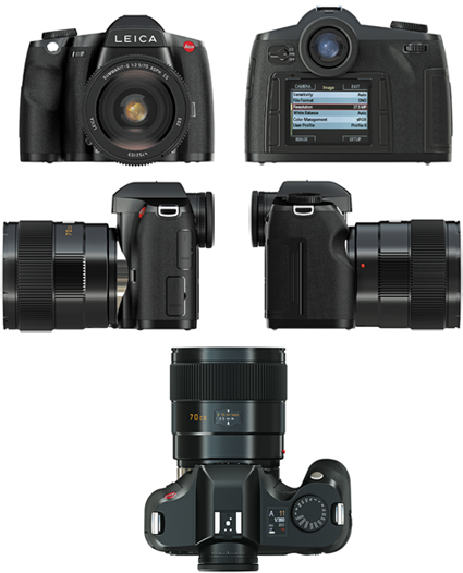 For a while now if you bought a Leica you got a free copy of Lightroom V4. Leica have now made there expected announcement that all new cameras, whether a re-badged Panasonic to a Leica M or Leica S, will come with a license for Lightroom V5.
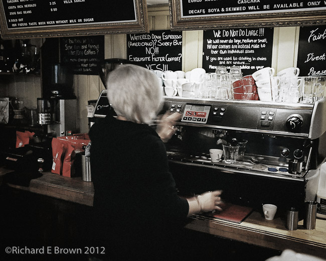
 It was a bit of a surprise considering that version 5 is now out but an update appeared the other day for version 4 users; version 4.4 was updated to version 4.4.1, mainly a bug fix but still nice to know V4 users are still getting some support.